Personal
Each Minova product adapts to the person. The identity feels welcoming, customizable, and never institutional.
Visual identity system 2.1
One focused identity for the Minova ecosystem—personal software built with clarity, capability, and respect for the person using it.
01 / Foundation
Minova should feel capable without feeling complicated. Every expression of the brand balances technical confidence with a calm, personal character.
Each Minova product adapts to the person. The identity feels welcoming, customizable, and never institutional.
Precise geometry and clear hierarchy communicate a serious tool that is ready for demanding workflows.
Graphite surfaces and restrained color create a composed environment where local-first features feel natural.
Two directional ribbons become one clear mark, representing different browsing paths shaped into a focused personal experience.
02 / Logo system
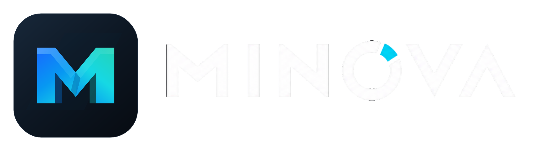
The Prism M is the product symbol. The custom MINOVA lettering is the official name mark, including its cyan O segment and clean outline-free edges. Use the full lockup for introductions and the symbol alone when the Minova name is already understood.
 Primary vector app icon
Approved lockup / icon and wordmark
 Official standalone wordmark / outline-free master
03 / Color
Night tones carry the interface. Cobalt, blue, cyan, and teal express navigation and action. Coral, amber, and green are reserved for clear functional meaning.
#0D121A#17202C#718195#F7FAFC#1769FF#0798F2#16D8E4#24D3B5#FF6B70#F4B84A#48D597#A7B5C5#1769FF -> #0798F2 -> #16D8E4 -> #24D3B5
04 / Typography
Bahnschrift gives headlines the engineered geometry of the wordmark. Segoe UI Variable keeps desktop, television, and web interfaces familiar and readable.
The web, shaped around you.
Use for product names, major page titles, release graphics, and concise campaign statements.
Search, organize, stream, and create across the Minova ecosystem.
Use throughout product interfaces, settings, menus, onboarding, documentation, and longer copy.
44 / 4630 / 3421 / 2616 / 2513 / 1805 / Graphic language
Angular folds and directional planes guide composition toward important information. They should imply focus and progress, never become decorative clutter.
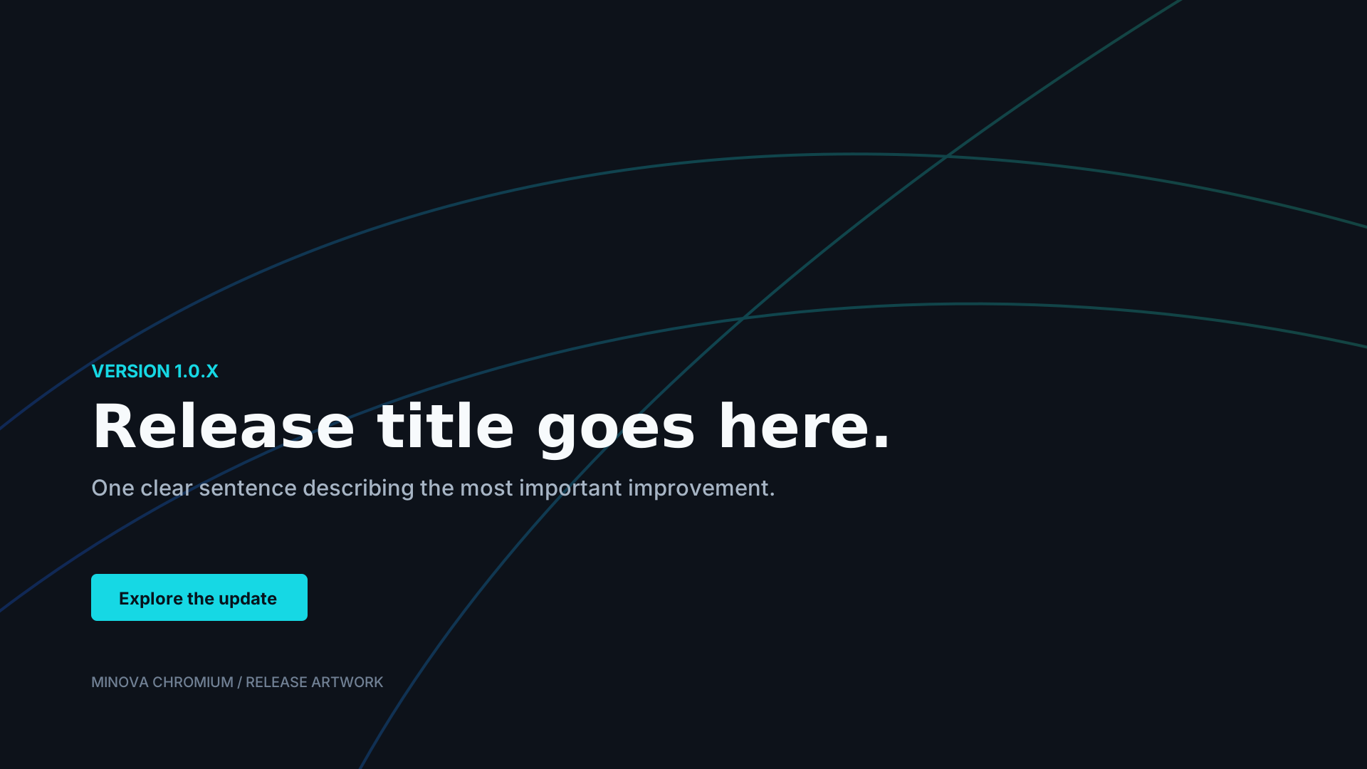
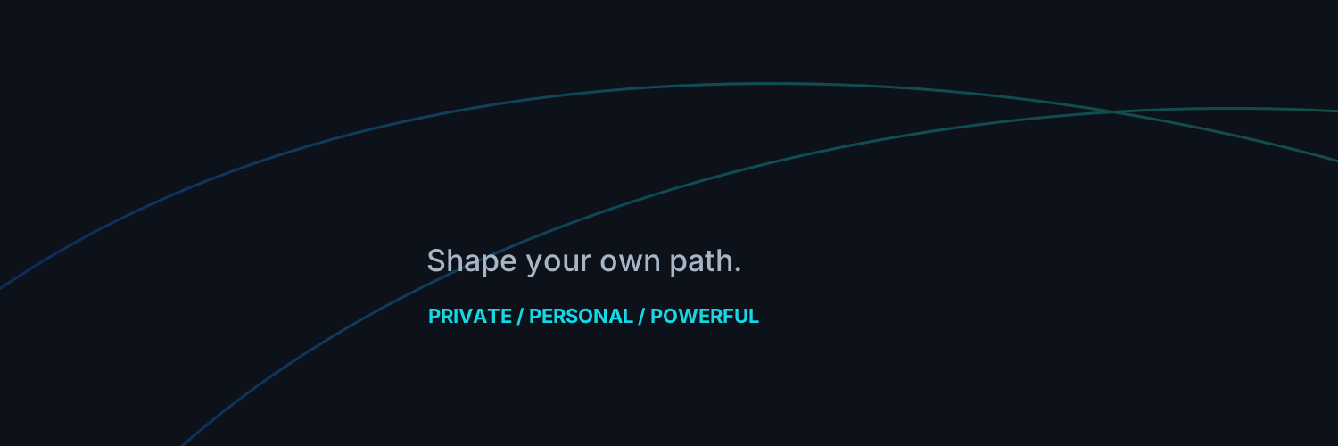
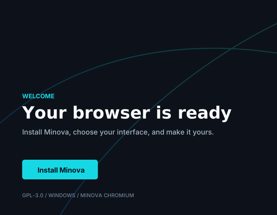
Use thin, low-contrast paths behind large messages, release artwork, onboarding, and installer moments.
Controls use 6 px corners. Panels and repeated items use no more than 8 px. Avoid pill shapes unless the control is genuinely compact.
Cyan is action, cobalt is depth, teal is positive movement. Coral, amber, and green communicate status only.
06 / Product expression
Minova Chromium uses quiet chrome around active web content. Minova Cinema uses a screen-first canvas built for distance and focus. Both share precise controls, confident spacing, graphite surfaces, and prismatic action color.
MinovaNew Tab
A composed new-tab experience keeps the brand present without competing with the user's content.
07 / Usage
Consistency makes the mark feel established. These rules apply across Minova Chromium, Minova Cinema, websites, installers, social graphics, documentation, and videos.
08 / Voice
Minova speaks like a knowledgeable collaborator. It explains what matters, respects the person's time, and never inflates simple features into grand claims.
“Your update is ready. Restart Minova when you are ready to install it.”
State what happened, what comes next, and whether the user is in control.
“Personal software that makes room for your way.”
Lead with tangible value. Keep headlines concise and support them with specific capabilities.
09 / Brand package
Use vector masters for product and print. Use generated PNG and ICO exports only where the target platform requires raster artwork.